Creating mycuraJOY app's B2B User Interface
Education
B2B
Desktop Experience
Summer 2024
curaJOY is a health-tech startup aiming to realize the unmet needs in the behavioral health space. Its browser app, mycuraJOY, is a tool utilized by professional healthcare specialists to automate behavioral and mental health data collection and translate large amount of data into meaningful insights that can inform care decisions. The product's "big-picture" concept for the B2B experience existed, but the company now needed to design the user interface and decide on the features for the MVP product.
challenge
Decide on the key features of the B2B experience for mycuraJOY and design the UI
constraints
Two weeks to complete the project and make sure designs are compatible with the already defined B2C experience
business impact
Gave company more confidence in the UX impact of designs and created feature roadmap for future iterations
team and role
Lead UX/UI Designer for a team of three designers (myself included) and one UX Researcher
responsibilities
Project planning and management, features definition, design work in Figma, usability testing
Tools
Figma, Figjam, Notion, Slack, usertesting.com

final solutions
Encouragement Feature
Send encouraging messages/videos to friends to support and motivate them towards their goal tasks.
Sending one encouragement a day is included as a daily task and viewable on home page and task page. Recipient will then be notified that an unviewed encouragement message is waiting for them that is viewable after completing a task.


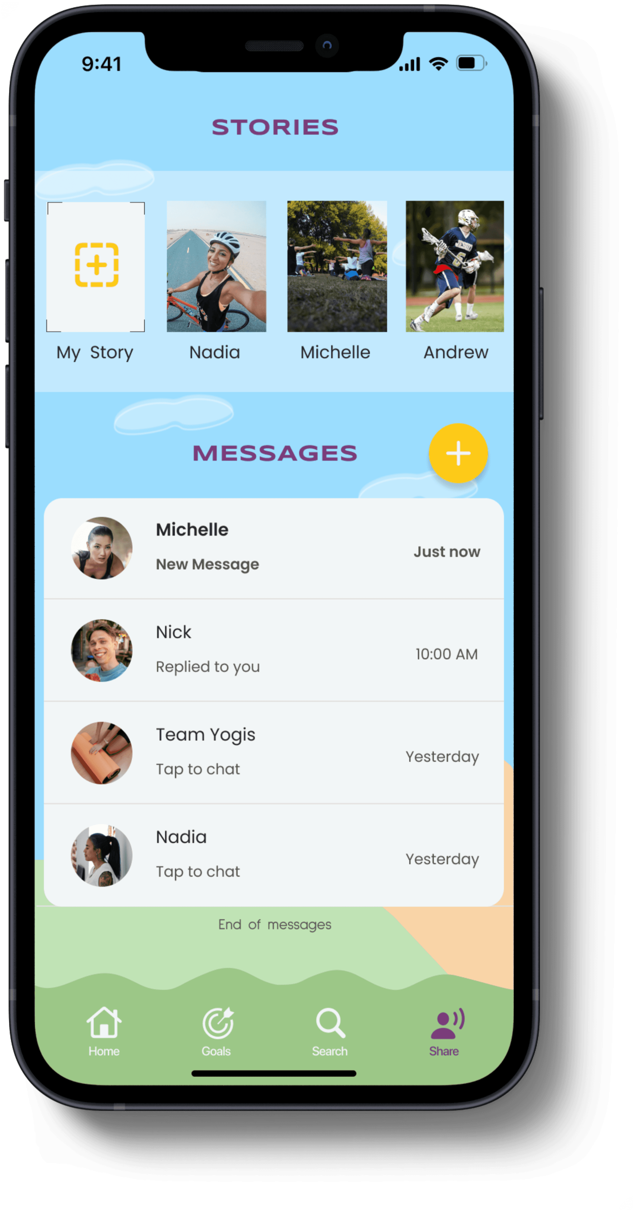
Stories Feature
Users have the ability to create a video or photo record of the day's activities and message it to their friends.
Sharing daily activities around goals can help users motivate each other to take action.
Messaging Feature
Users need a way to stay connected and in communication with each other and to not feel alone in their goals.
Messaging is formatted in the text message style and forms the basis for a written log of conversation. It is also the location for any responses generated from Encouragements or Stories.

Project parts
The Lost Week
Research
Ideation
Prototype
Test
The Lost Week
starting point
I started out being provided the following:
MVP use case : FBAs
target user: case agent & agencies
product constraints: split up features onto 3 pages and incorporate already defined product features
time constraint: get the project done in 2 weeks
design resources: design system, previous screen design
initial challenges
previous designers did not leave documentation for design choices made on their drafts
either research wasn't done with target users before or I wasn't able to locate documentation of said research
Secondary research was not easily doable b/c it was subscription-based and Googling did not retrieve visual examples for reference. Not enough time or resources to subscribe as test as an actual user
initial plan
work with in-house expert who has experience that matches the target users
interview expert to understand her experience and what she needed to complete her user tasks
categorized features by priority using MoSCoW method
started creating wireframes
wk2: high-fidelity
Typically to gain better understanding, I would prioritize research to understand the problem space, but I was worried the timeframe was too tight to conduct research effectively. In the end, I planned on having
plan change
at end of wk 1, I touched based with the product owner and discovered that although the project was allotted 2 weeks, based on product launch dates, I had more time than that to deliver designs to developers
UX Researcher became available to join the team
asked for a project restart to create a more formal project that incorporated opportunity to gather 1st hand research through user interview
lesson learned
misunderstanding arose regarding a fundamental purpose of the product the owner was envisioning. My assumption: creating a product to replace the user's current practice management software that integrates curaJOY's unique data collection capabilities. Reality: creating a tool to be used in conjunction with current FBA management software
my mistake cost me a week but what saved me from losing another two weeks was the frequent check-ins and careful documentation. because of that,I had opportunity to correct misunderstandings in scope and product purpose
Lesson learned: always make list of assumptions: in case designs are built off a wrong assumption, make a list of project, deliverables, and product assumptions. Have it reviewed before starting any project work
Research
Objectives
Day 2’s purpose was to brainstorm for possible solutions quickly. While I looked towards competitors within the same industry for inspiration, I also looked at a tangential competitor from another industry. I did so to broaden my imagination and learn from concepts that abstracted away industry limitations. Ideation was done on paper to maximize speed.
Research
Our target user
persona img here
Pain points - Competitor's products and attitudes about AI
UI is inconvenient and requires too much clicking
Lack of data visualization capabilities means there is no quick, intuitive way to interpret data
Users are distrustful of data analysis done by AI
lesson learned
misunderstanding arose regarding a fundamental purpose of the product the owner was envisioning. My assumption: creating a product to replace the user's current practice management software that integrates curaJOY's unique data collection capabilities. Reality: creating a tool to be used in conjunction with current FBA management software
my mistake cost me a week but what saved me from losing another two weeks was the frequent check-ins and careful documentation. because of that,I had opportunity to correct misunderstandings in scope and product purpose
Lesson learned: always make list of assumptions: in case designs are built off a wrong assumption, make a list of project, deliverables, and product assumptions. Have it reviewed before starting any project work
Pain Points
Users found it hard to style apartment while staying within budget
Too many product offerings made the shopping experience time-consuming and overwhelming
Users couldn't visualize decor in their actual apartment space
Users didn't know how to translate online inspirations into reality
Day 3 - Concept Design
objective
Now that I had some solution ideas, it was time to narrow down on the best ones to keep developing. I chose the best solutions that:
solved for the users’ pain points
worked within the client’s constraints
were technically feasible
storyboard
Since I would only have one day to develop the screens I needed for testing, creating rough sketches for a storyboard helped me prioritize and visualize the most important screens. Effectively, it acted as a low-fidelity wireframe.

Day 4 - Prototype
objective
In order to test the solution concepts with users, it was necessary to create a functioning prototype that could mock what the shopping experience would be like. Due to the tight time constraints, branding and styling of screens were of minimal concern as long as screens did not distract the users from the tasks.
solutions
Augmented-Reality powered virtual room simulator
Using photos of their real space, user would feed the information into the room generator and a virtual rendition of their apartment space would generate. Users can place decor items and move them around.


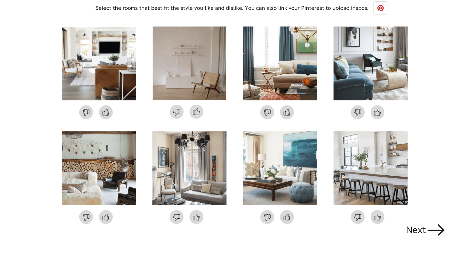
Customization Quiz
Users fill out a quiz that asks about style preferences and budget. Using that information, a curated set of decor items would be recommended and placed in the room simulator. Users can add or augment the starter set of decor items.


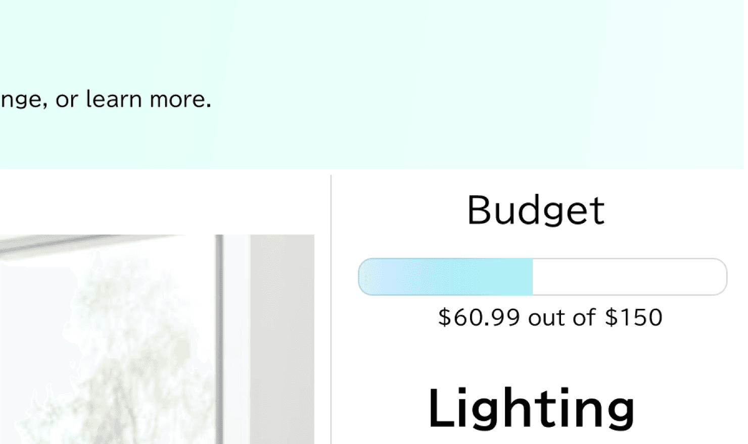
Budget Tracker
A progress bar - styled tracker would appear on the virtual room simulation page for users to clearly see how much their decor items cost where the costs are in relation to their total budget. Adding or subtracting items would dynamically be reflected in the budget bar.


Day 5 - Test & Analyze
objective
Predicting whether a design feature will be used by users boils down to discoverability and understanding. If users saw the features and understood their purposes, they could decide to utilize it during their shopping experience.
The main questions we wanted to answer were:
Do users understand the virtual room simulator and are they able to see the decor items in their actual space?
Do users understand that the style quiz will guide customization of recommended decor items?
Are users able to monitor their budget and spending as they shop?
results
Highlights
100%
of users understood the virtual room tool’s purpose
95%
of users saw and understood the budget tracker’s purpose
90%
of users understood that the style quiz’s purpose
Summary & Next Steps
summary
Augmented Reality-powered room simulator
Adds massive benefit to the user’s experience because it solves for the visualization issue
More technically advanced and will take more time and resources to build
Customization Quiz
Easy to create and implement
Decreases overwhelm and time spent shopping by hiding irrelevant products
Helps users stay within budget by filtering out items that are too expensive
Low risk design - frequently used in many products
Budget Tracker
Easy to create and implement
Helps users easily stay informed on their prospective spending before moving to checkout page
Low risk design - frequently used in many products
next steps
Implement budget tracker
Implement customization quiz
Conduct more research (cost-benefit analysis, additional ideation sprints, etc) if stakeholder buy-in is needed, or create a project to implement the AR room simulator
